Visual identity · 2024
Kaixin Sushi
RoleVisual identity & applications
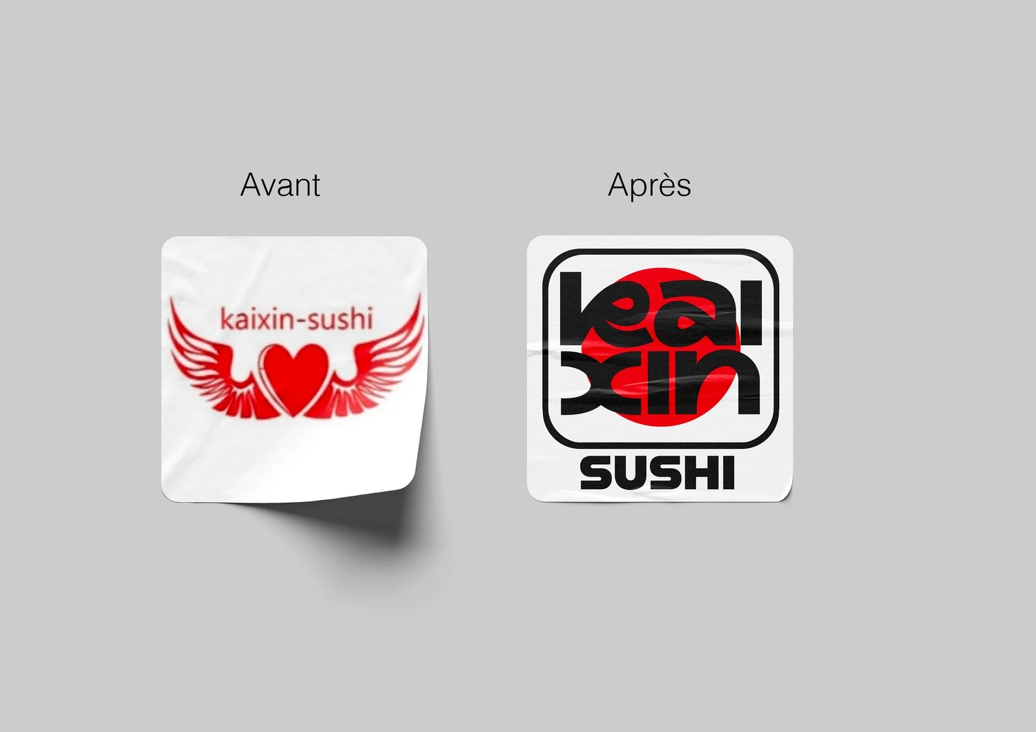
A rebranding exercise for a sushi restaurant, with a simplified logo and contemporary Japanese visual references.
- The brief
- Revisit a sushi restaurant’s mark and applications as a personal rebranding exploration.
- Design choices
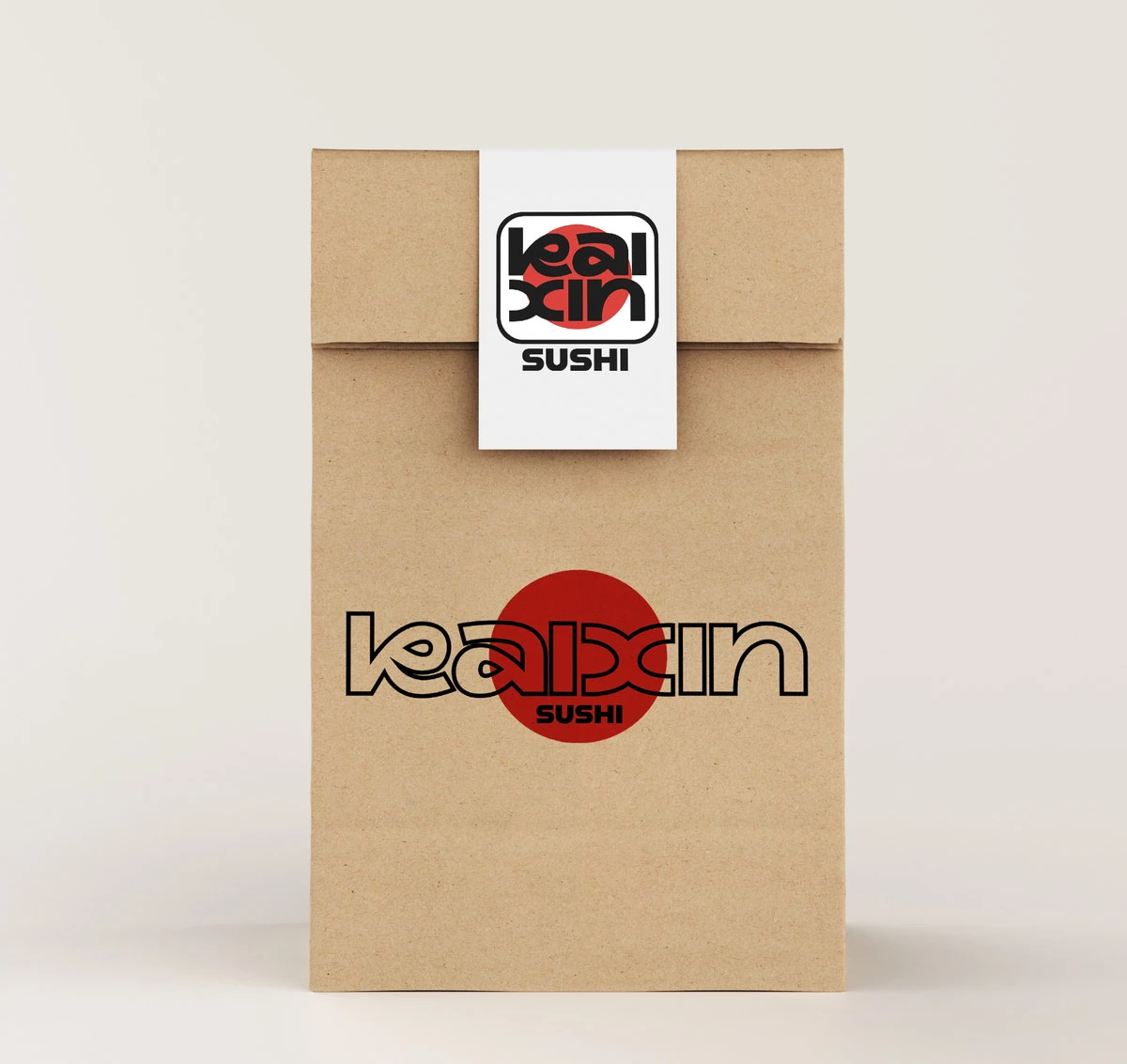
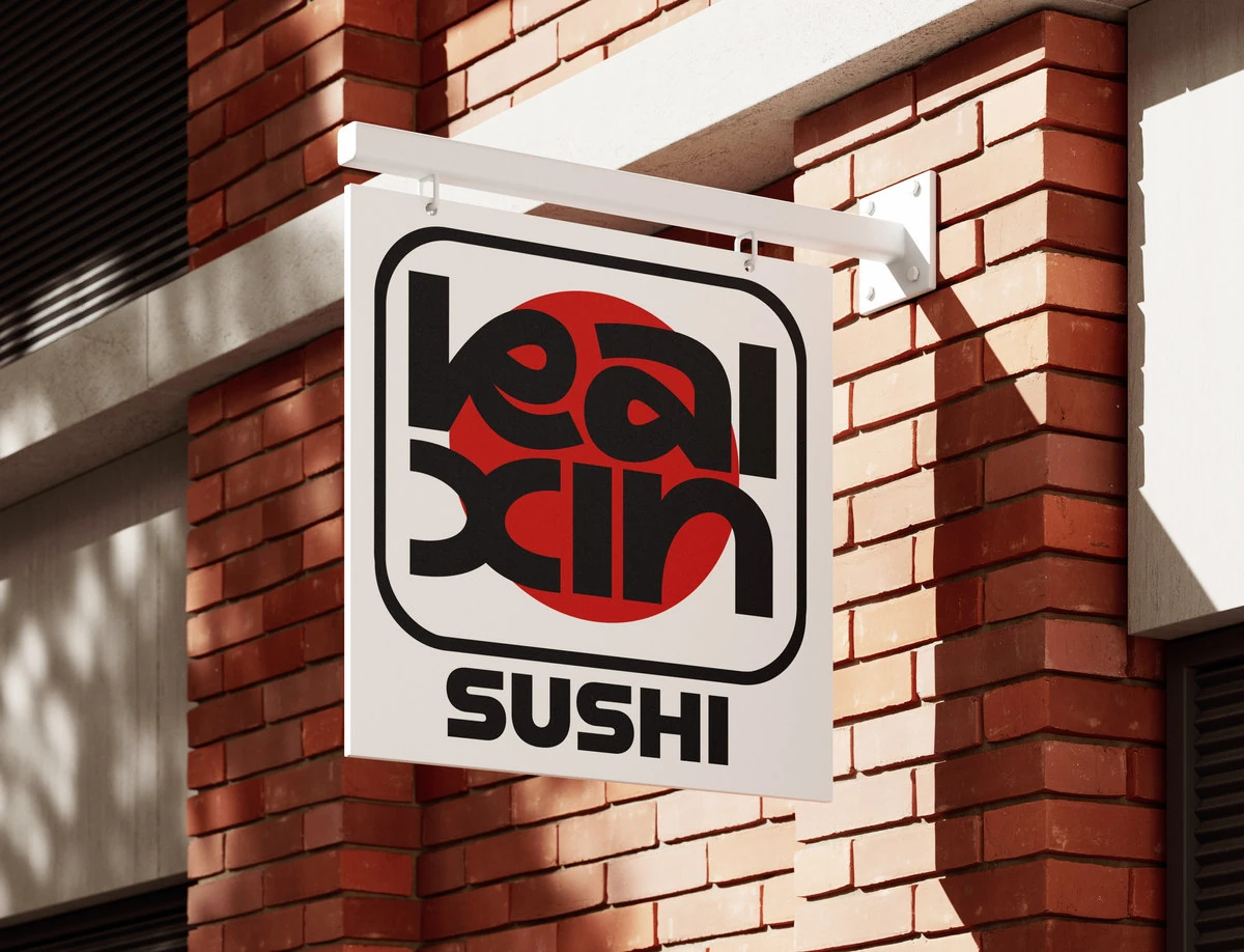
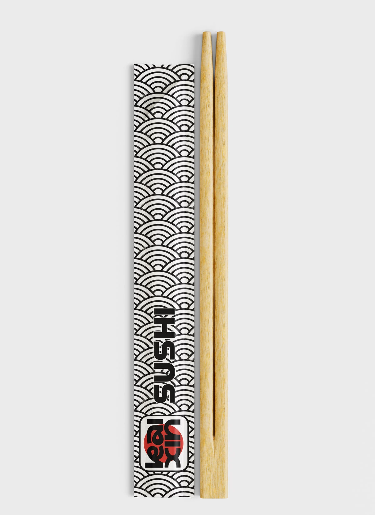
- Simplify the logo and develop a pattern to give the sign and takeaway applications a shared visual language.
- The outcome
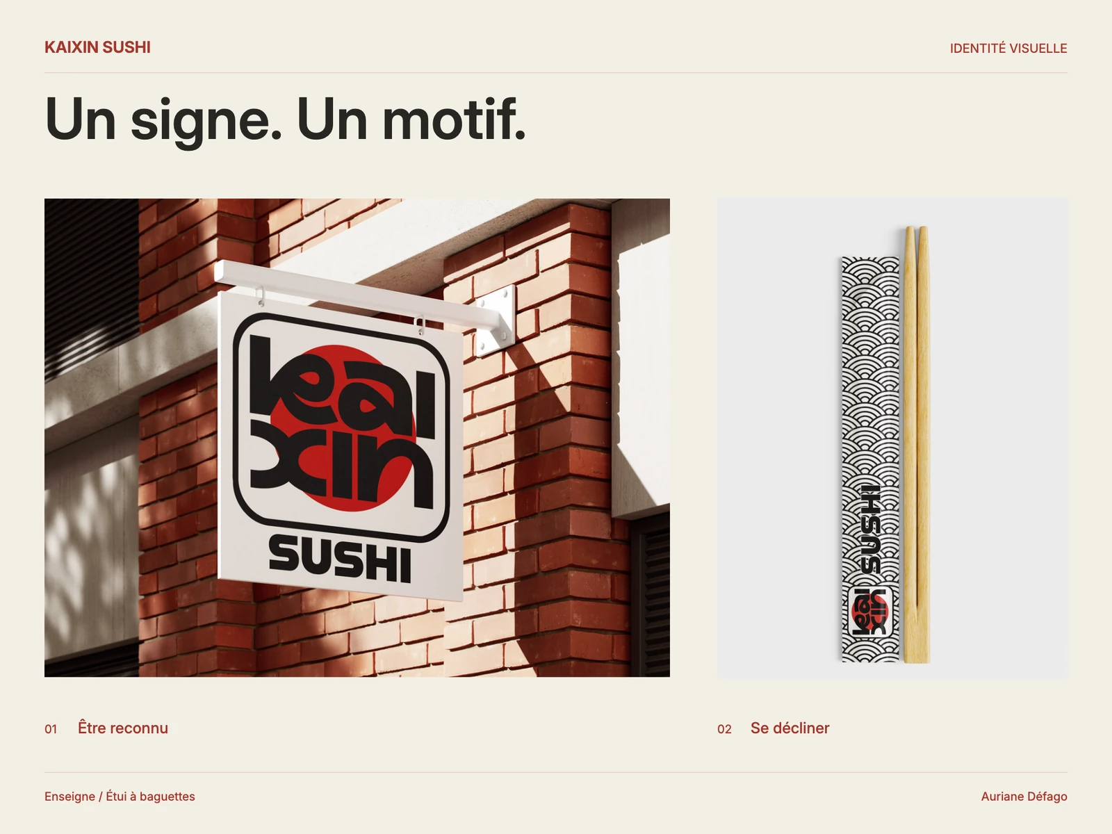
- An identity proposal shown on a sign, bag and chopstick sleeve, alongside a before-and-after view of the logo.
A personal exploration of branding, legibility and a coherent visual identity.