Identity & packaging · 2025
MIZU
RoleVisual identity, packaging & art direction
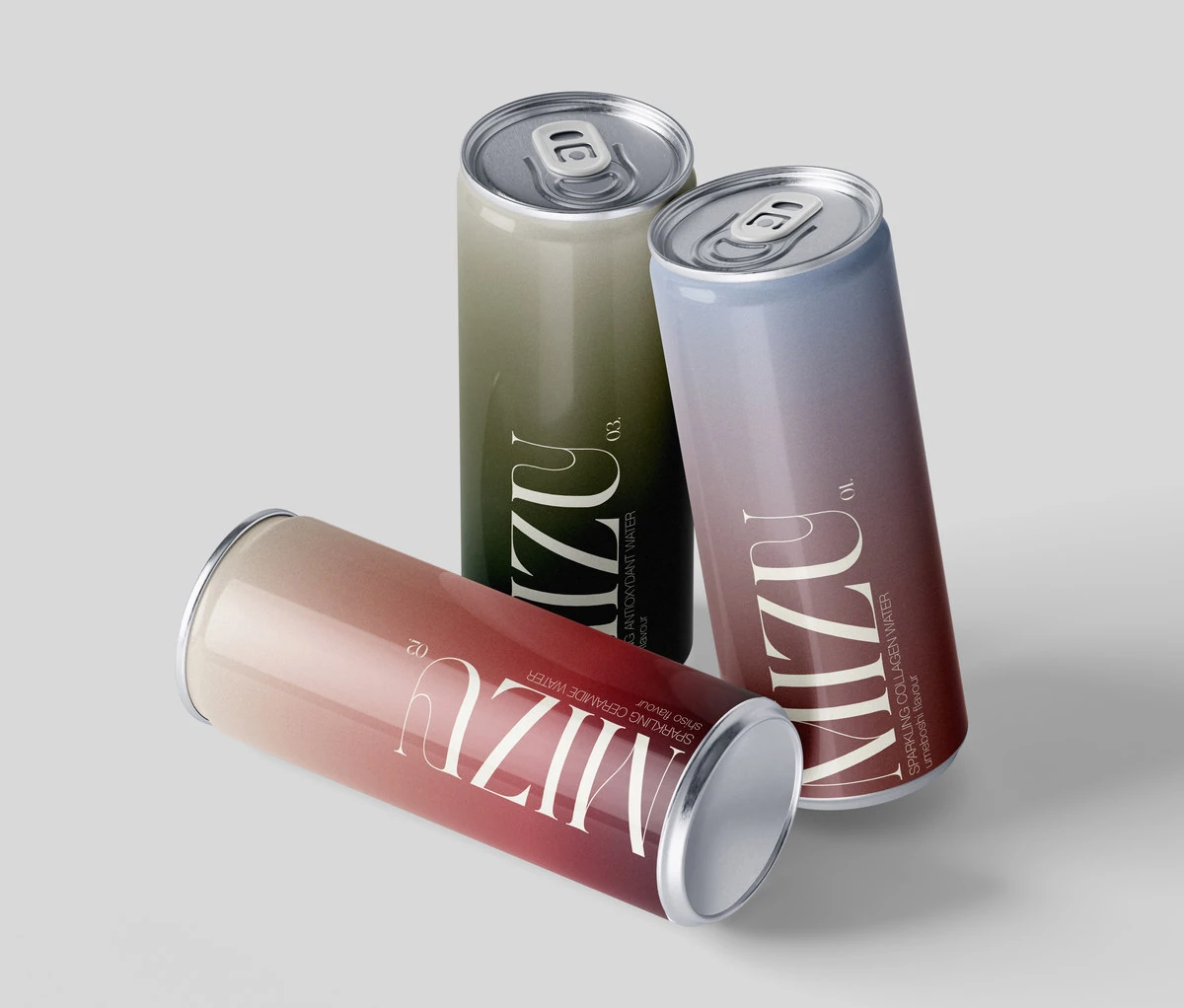
An identity for a conceptual sparkling water range inspired by skincare rituals and Japanese flavours.
- The brief
- Give form to the idea of “drinkable skincare” for a conceptual sparkling water brand in a school project.
- Design choices
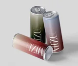
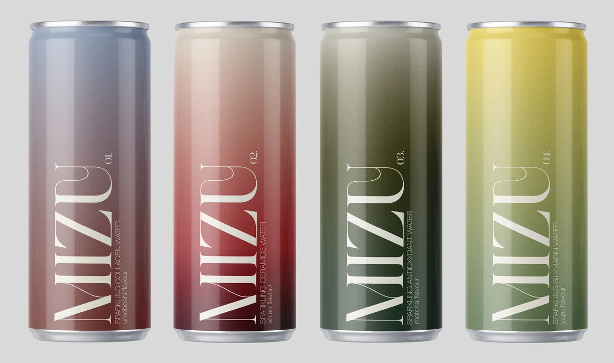
- Distinguish four flavours through soft colours and build a visual language around light, fluidity and transparency.
- The outcome
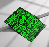
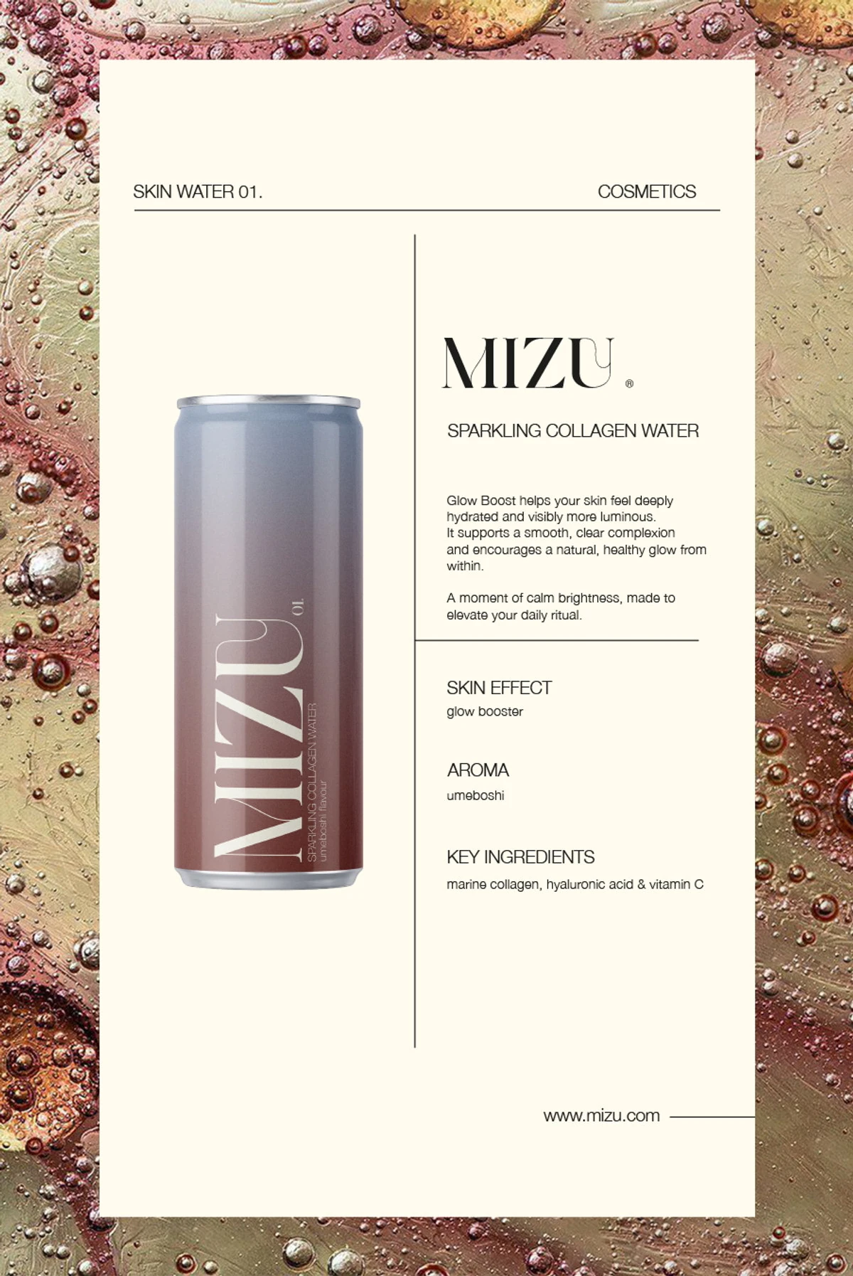
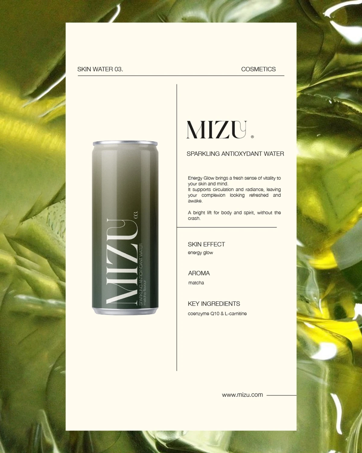
- A range of cans and two posters exploring umeboshi and matcha notes.
A school project in branding, packaging and art direction for a concept of “drinkable skincare”.